Built-in Components
UIFlow Free provides a set of common UI components, accessible through UIFlowUI or as scene nodes.
Toast
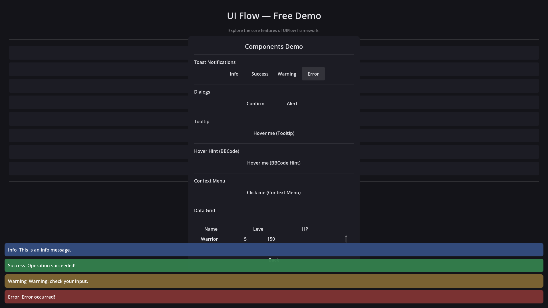
Lightweight popup notifications:
UIFlowUI.Toast.show_toast("Saved successfully", "success")
UIFlowUI.Toast.show_toast("Network disconnected", "error", 3.0)
Customizing Toast
Change exported properties at runtime:
UIFlowUI.Toast.toast_position = UIFlowToast.Position.BOTTOM_CENTER
UIFlowUI.Toast.max_visible = 3
UIFlowUI.Toast.default_duration = 2.0
Register custom types with their own color, duration, sound, or even a custom item scene:
var achievement := UIFlowToastType.new()
achievement.bg_color = Color(0.2, 0.2, 0.2, 0.95)
achievement.text_color = Color.GOLD
achievement.default_duration = 5.0
achievement.custom_scene = preload("res://UIScene/MyToastItem.tscn")
UIFlowUI.Toast.register_type("achievement", achievement)
Confirm / Alert Dialogs
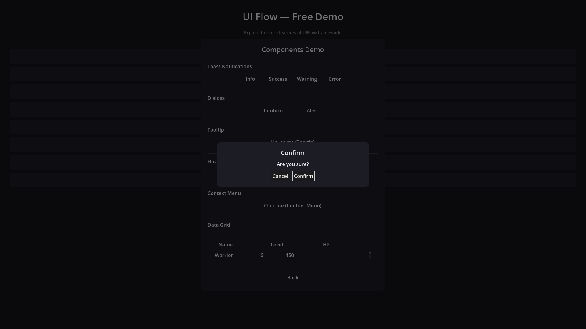
UIFlowUI.Confirm.show_confirm("Delete save file?", "Are you sure?", _on_confirm, _on_cancel)
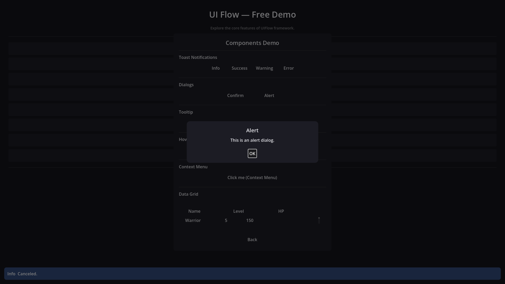
UIFlowUI.Alert.show_alert("Operation complete", "Your data has been saved.")
Customizing Confirm / Alert
Both dialogs expose exported properties for button text, icons, and custom button scenes:
UIFlowUI.Confirm.confirm_text = "OK"
UIFlowUI.Confirm.cancel_text = "Back"
UIFlowUI.Confirm.cancel_first = false
UIFlowUI.Confirm.custom_button_scene = preload("res://UIScene/MyButton.tscn")

UIFlowUI.Alert.ok_text = "Got it"
UIFlowUI.Alert.ok_icon = preload("res://icon.svg")
Per-call overrides are also supported:
UIFlowUI.Confirm.show_confirm(
    "Quit", "Really quit?",
    func(): get_tree().quit(),
    Callable(),
    {"confirm_text": "Yes", "cancel_text": "No", "cancel_first": true}
)
For full control, subclass UIFlowConfirmDialog or UIFlowAlertDialog and override _create_button() or _create_ok_button(), then replace the default instance:
DataGrid
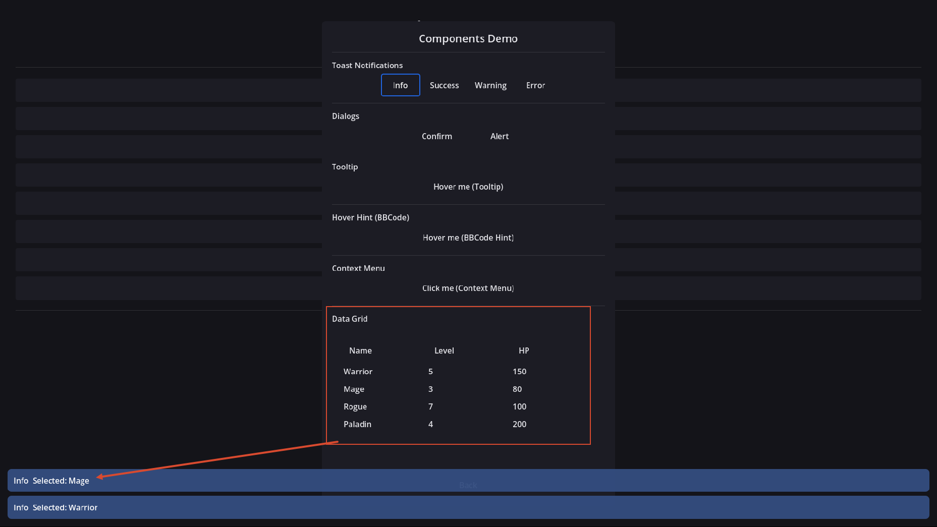
Display tabular data with column definitions, sorting, and selection callbacks:
var grid := $DataGrid
grid.add_column("Name", 200)
grid.add_column("Level", 80)
grid.add_column("HP", 100)
grid.set_data([
    ["Warrior", 5, 150],
    ["Mage", 3, 80],
])
You can also define columns with set_columns([{"title": "Name", "width": 200}]).
InventoryGrid / ItemSlot
Slot-based inventory grid with drag-and-drop, bound to an InventoryData resource. Slots show the item icon, or the first letter of the item name with a rarity-colored border when no icon is set:
var inventory := InventoryData.new(20)

var potion := ItemData.new()
potion.item_name = "Health Potion"
potion.rarity = ItemData.Rarity.COMMON
inventory.add_item(potion)

$InventoryGrid.setup(inventory)
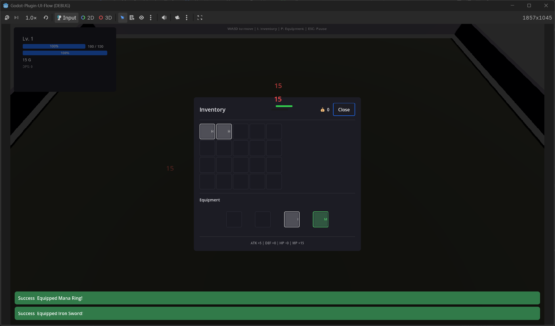
The grid emits item_right_clicked and forwards per-slot item_dropped events so you can wire equipment slots, context menus (UIFlowContextMenu), and tooltips (UIFlowTooltip) — see the Survivors demo for a full example.
Quick Equipment Binding
UIFlowInventoryGrid.bind_equipment_slots() removes the boilerplate for drag-and-drop between inventory and equipment:
$InventoryGrid.setup(inventory)
$InventoryGrid.bind_equipment_slots(equipment_data, {
    &"weapon": weapon_slot,
    &"chest": chest_slot,
})
Right-clicking an inventory item emits item_right_clicked(item, slot_index, pos); equippable items can be equipped directly or through a context menu.
EquipmentGrid
UIFlowEquipmentGrid creates a labeled grid of equipment slots that handle drop-to-equip, type filtering, and display sync automatically:
var grid := UIFlowEquipmentGrid.new()
grid.slot_names = {&"weapon": "Weapon", &"chest": "Chest"}
add_child(grid)
grid.setup(equipment_data, inventory_data)
grid.slot_right_clicked.connect(_on_equipment_right_clicked)
Each slot is a UIFlowItemSlot with setup_equipment() already wired, so drag-and-drop from an inventory grid works out of the box.
VirtualList
Large lists that only render the visible area:
Tooltip / HoverHint
Show hints on hover. Popups are reparented to a high [CanvasLayer] (above the page stack) while visible:
$HoverHint.hint_text = "Attack +10"
UIFlowHoverHint.attach($Button, "[b]Rich Text[/b]\nSupports BBCode", true)
UIFlowTooltip.attach($Button, "Click to confirm")
Input Prompts
UIFlowInputPrompt is a small badge + label chip for on-screen button hints. Letter badges work out of the box; optional Kenney Input Prompts (CC0) textures can be dropped in addons/ui_flow/assets/input_prompts/ and assigned to icon.
Code Overlay
Free Demo uses UIFlowCodeOverlay (CanvasLayer) to show page API snippets. Press F1 to toggle. Prefer this over the legacy sidebar UIFlowCodePanel, which could sit under the page layer.
Input Action Bar
UIFlowActionBar renders the current top page's declared UIInputActionNode entries as a hint bar (key/icon + label), similar to Unreal CommonUI's bound action bar. Drop it into a HUD scene — it auto-follows the navigation stack:
Actions show their icon when set, otherwise the key bound to godot_action (e.g. [I]). Disabled actions are hidden by default; set show_disabled = true to keep them visible but dimmed. See the Survivors demo HUD for a live example.
Children Switcher
UIFlowChildrenSwitcher applies one discrete state across multiple NodePath targets at once (optional patches: visible, modulate, scale, disabled, font_size, …). That multi-child switch is the point — card selected/disabled, slot empty/filled, step indicators.
$CardSwitcher.set_state(1)                 # updates icon + title + detail + button together
$CardSwitcher.set_state_by_name("selected")
In the editor, change Preview State to live-preview. Use Bake Current State to write that look into the scene baseline (and initial_state); casual saves restore the baseline so unrehearsed previews do not pollute the .tscn.
See Free Hub → Workflow Glue for a multi-target card example plus the other glue components.
Workflow Glue
Lightweight scene nodes that remove everyday UI boilerplate. Demo: Free Hub → Workflow Glue.
| Component | Role |
|---|---|
UIFlowPageOpener |
Push / replace / async / instance-open a page from a Button |
UIFlowPageCloser |
Pop / pop-to-root / close-by-script |
UIFlowChildPool |
ensure_count(n, init_fn) — ReserveChildren without a data array |
UIFlowInputRelay |
Local InputMap → signal (optional focus/visibility gates) |
UIFlowHoldRepeater |
Hold-to-repeat ticks for steppers / fast scroll |
UIFlowCooldownGate |
Rate-limit presses (accepted / rejected) |
UIFlowVisibilityGroup |
Exactly one of N targets visible |
UIFlowAutoFocus |
Grab focus on ready / when page shown again |
# Button with opener child — no pressed handler needed
$OpenShopBtn/PageOpener.page_script = ShopPage
$OpenShopBtn/PageOpener.mode = UIFlowPageOpener.Mode.PUSH

# Fixed skill slots
$SkillPool.ensure_count(6, func(slot, i): slot.setup(skills[i]))
Custom Components
Extend UIFlowComponentBase to implement project-specific components that follow the UIFlow lifecycle.